Transforming Static Content into Interactive Apps: My First Lovable Build
- Kisha Velazquez

- May 24
- 7 min read
Updated: May 28

I’ve been experimenting with vibe coding lately, mostly by attending AI builder events and co-working sessions around New York City.

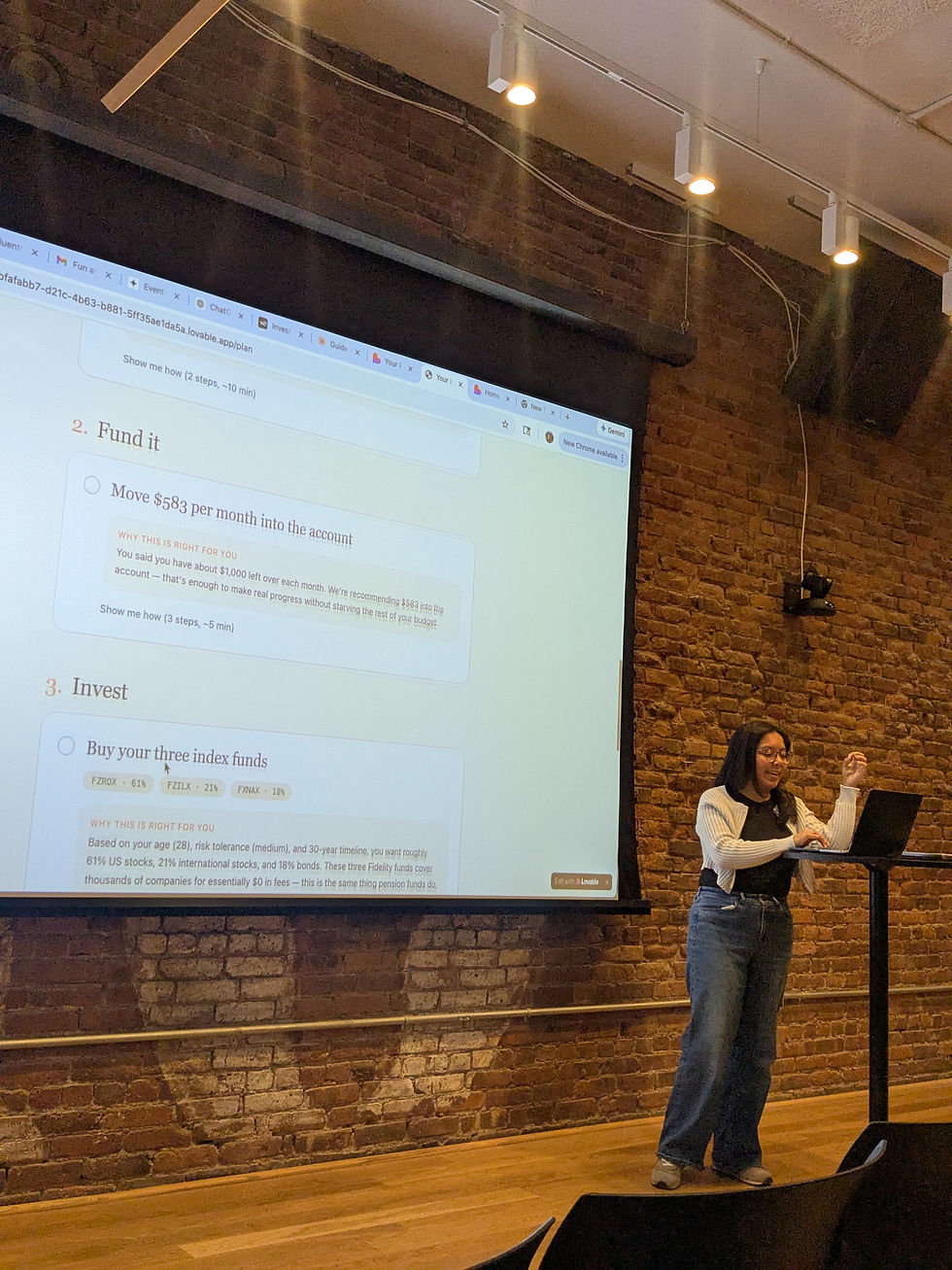
I’ve gone to a few of them now, but the recent Lovable co-working session hosted by AI Snack Club was the first time everything really clicked. Not just the tool. Not just the process. The possibility.✨
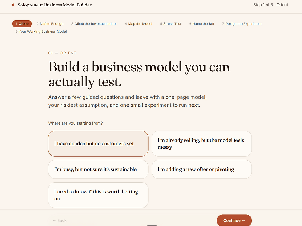
In one session, I turned my friend Bianca van der Meulen's 45-page business model canvas workbook into an interactive app prototype designed to help solopreneurs clarify their business model and, eventually, support lead generation for her business and brand consultancy.
And honestly, it was a little mind-blowing.
From static workbook to guided experience
Bianca originally created the workbook to help solopreneurs think through their business model with more clarity. It asks the kinds of questions every early-stage founder, consultant, or service provider needs to answer, but often avoids because they feel big, messy, or overwhelming.
Check out the original workbook👇🏾
Questions like:
How much money do you absolutely need to make each month for this business to be viable?
Do you want a low-volume, high-ticket offer, a higher-volume model, or something in the middle?
What are your non-negotiables as a solopreneur?
Who do you want to serve, specifically?
What assumptions do you need to question?
As a PDF, the workbook was thoughtful and useful. But like many long-form resources, it required the user to create their own momentum.
They had to open it, read through it, figure out where to start, keep track of their answers, and make sense of the bigger picture on their own.
The app changed that experience.
Instead of asking someone to work through a 45-page PDF alone, the app guided them through the process step by step. It told them upfront that the experience would take about 15 minutes. It broke the questions into clear sections. As the user answered, the app started shaping those responses into something more useful.
A business compass statement.
A clearer picture of their audience.
A working business canvas.
A final clarity snapshot they could download as a PDF or copy and paste into another document.
That shift matters.
Because sometimes the difference between “this is helpful” and “I actually finished this” is the experience around the content.
The real lesson: content does not have to stay static
As a content strategist, this is the part that stayed with me. We talk a lot about repurposing content. Turning webinars into clips. Turning podcasts into blog posts. Turning reports into LinkedIn carousels. All of that still matters.
But tools like Lovable open up another layer of repurposing:
→ Turning content into a product experience.
→ A workbook can become an interactive diagnostic.
→ A calculator can become a lead-generation tool.
→ A strategy framework can become a guided assessment.
A PDF can become something that asks questions, adapts to the user, summarizes their answers, and helps them take the next step.
That’s a very different way to think about content. It moves the asset from passive to active. From something someone consumes to something someone uses.
Tips for building your first app with Lovable
One of the biggest lessons from the session was that vibe coding works best when you slow down before you speed up. Lovable can generate quickly, but the quality of the output depends on how clearly you explain what you want.
Here are the tips that helped the most:
1. Hit “Plan” mode first
Before you ask Lovable to build anything, use Plan mode. The button turns blue when it is on, and that is your reminder to think before you build.
Plan mode helps you talk through the app idea, clarify the goal, and avoid wasting credits on vague or half-formed prompts. You can also use ChatGPT first to draft a stronger prompt, then bring that into Lovable.
The big takeaway: do not make the app build while you are still figuring out what you want.
2. Start small
Build the most basic function first. Then add features one by one.
It is tempting to ask for the full vision right away, but that can make the app messy fast. For my project, the simplest version was: guide a user through Bianca’s business model canvas questions and generate a clear summary at the end.
Once that worked, then I could think about better formatting, downloads, copy/paste functionality, styling, and lead capture.
3. Focus on function before fashion
Get the logic right before you obsess over how it looks.
The app needs to work first. Can the user move through the steps? Do the questions make sense? Are the answers being captured correctly? Is the final output useful?
Design matters, but a beautiful app that does not work is just a pretty problem.
4. Plan the basics before you prompt
Before prompting, answer four simple questions:
What are you building?
Who is it for?
Why does it matter?
What is the key action the user should take?
For example:
I’m building an interactive business model canvas for solopreneurs. The goal is to help them clarify who they serve, what they offer, their financial goals, and their non-negotiables. The key action is completing the guided questions and downloading a business clarity snapshot.
That kind of clarity makes the first output much stronger.
5. Give visual direction early
Design should not be an afterthought. You do not need a full brand guide, but you should give Lovable a clear visual lane.
The deck gave examples like:
Calm and elegant
Bold and disruptive
Premium and sleek
You can also use references like:
Use a clean, editorial design with warm colors, soft cards, generous spacing, and a calm premium feel.
The phrase that stuck with me was:
Don’t prompt your way into good design. Prompt from it.
In other words, give the tool a design direction instead of hoping it guesses correctly.
6. Prompt by component
Instead of asking Lovable to fix or create the entire app at once, work section by section.
For example:
Hero
Question flow
Feature grid
Testimonials
Pricing
Final results page
Download section
Lead capture form
A full-page prompt can create noise. A section-based prompt creates signal.
7. Use tone words intentionally
Buzzwords are not just fluff when they help define the style.
Words like minimal, cinematic, playful, premium, expressive, developer-focused, brutalist, or editorial can help guide the feel of the app.
For my project, I would probably use words like:
Editorial, warm, strategic, calm, premium, and practical
That gives the app a clearer personality without over-explaining every design detail.
8. Iterate small
Make one change at a time.
This is especially helpful when something breaks or gets weird. If you ask for five changes at once, it is harder to know which request caused the problem.
A better prompt might be:
Update only the final summary page. Keep the structure the same, but make the copy warmer and easier to skim.
9. Use visual edits for small design changes
For text, color, and font tweaks, use visual edits when possible. It is faster and helps you make small adjustments without rebuilding whole sections.
This is useful when the app is already working and you just want to refine the look.
10. Ask Lovable to clarify before building
One of the best prompts from the deck was:
Before building, ask me 3 clarifying questions about the design, target audience, and core features I need.
That is such a simple move, but it helps prevent vague inputs from becoming vague outputs.
The bigger takeaway
The best Lovable builds do not start with “make me an app.”They start with a clear plan.
What are you building? Who is it for? What problem does it solve? What should the user be able to do by the end?
Once that is clear, Lovable can move incredibly fast. But the strategy still has to come from you.
Why this felt different from other AI experiments
I’ve attended a few vibe coding sessions before, but this was the first one where I understood how close you can get to a minimum viable product from a first pass.
The biggest unlock was the planning.
Before building, I worked through what the app needed to do, how the user should move through it, what questions it should ask, and what output it should generate. With that thinking done upfront, I could create a strong prompt in ChatGPT and bring that into Lovable.
That first version was surprisingly close. Not perfect. Not final. But close enough to test, refine, and show people. That part still feels wild to me.
Five years ago, building an interactive calculator or guided tool like this would have required months of back-and-forth with a developer. You would need wireframes, requirements, design rounds, development time, QA, and probably a lot of “can we change this one thing?” emails.
Now, a strong first pass can happen in seconds. The work does not disappear. You still need strategy, structure, taste, editing, and testing. But the distance between idea and prototype is dramatically shorter. That changes what marketers, consultants, and founders can create.
The community made the experience better
The other thing that stood out was the room.

The AI Snack Club session was full of women building practical tools for real problems. People were generous with feedback. They asked good questions. They offered ideas without making anyone feel behind or out of place.
One attendee was building a financial literacy app for first-generation Americans. The app considered real-life complexities like sending money to family in another country, supporting adult parents, and learning how to invest while navigating cultural and family responsibilities.
That kind of idea reminded me why these spaces matter.
The most interesting AI use cases are not always the flashiest ones. Sometimes they are tools that make hard decisions easier, make information more accessible, or help people move from confusion to clarity.
That was the energy in the room.
Not AI for the sake of AI. AI as a way to build things that solve real problems.
What I’m taking with me
This experience shifted how I think about content strategy.
A strong piece of content does not have to end as a PDF, a blog post, or a landing page. It can become an experience. It can guide a prospect through a decision. It can help someone understand their needs. It can create a useful output. It can support lead generation without feeling like a generic form fill.
For consultants, founders, coaches, and service providers, that is a huge opportunity.
Many already have strong frameworks sitting in decks, PDFs, spreadsheets, and notebooks. The next step may not be “turn this into more posts.”
It might be:
How can this become something people can use?
That’s the question I’m sitting with now.
I’m still testing and refining the app, but building it helped me see what is possible when content strategy, AI tools, and community come together.
And now I’m much more interested in helping people turn their static expertise into interactive tools.
Not because every PDF needs to become an app. But because some ideas become more powerful when people can experience them step by step.
Test the app out for yourself and let me know what you think!


